I think the top 10 world’s worst PowerPoint presentations have two common weaknesses. The first is that the information in the presentation will confuse the audience. The second is that the pictures and words in the text make it difficult for the audience to read.
- The first disadvantage is that the presentation violates the redundancy principle. The principle of redundancy emphasizes the avoidance of duplicate information and the use of graphics instead of text. In the world’s 10 worst PowerPoint presentations, presentations that add extra pages and mismatched pictures, and a lot of text in one page. The audience’s attention is distracted, and they are likely to spend time thinking about the meaning of the images as well as reading a lot of text.
- The second disadvantage arises because the Signaling Principle is not used. In many ppt pages, the author wants to use different colors or use other forms to tell knowledge. However, the presentations in the world’s 10 worst PowerPoint presentations don’t let the audience know what the point of the PowerPoint on this page is. The PowerPoint on each page is likely to have non-meaningful color classifications, or numerous charts, slideshows with advertisements. While all of this knowledge may be mentioned in the teaching, using bright colors and large fonts to highlight the key points will give the audience a better understanding of what they are actually learning today.
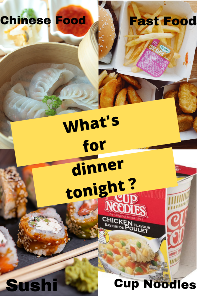
I used a simple infographic to describe what I need to agonize over every night. First, I name 4 different types of meals. My fourth (lower right) meal name is a bit off because the “Add comment” and “Move” keys are overlaid on top of each other. Second, I use a larger font, put the core of the message in the very center, and separate the font from the image on the orange floor. I do this so that the audience can better see the core issues. For the meal text, I also put the text in four different positions, so that when the audience sees the pictures, they can also know what type of meal it is. I also had to change the color of the font to make the words easier to see because of the bright color of the meal images. I switched to 5 different colors and ended up going with black. Finally, 4 pictures I try to choose simple pictures. But looking for images on the Canva website is generally a bit more complicated.
2022-10-09 at 11:13 pm
Hey Junyi,
I couldn’t agree more with your comments about the Worst PowerPoint presentations. These slides use too much unnecessary text and violate the principle of redundancy. Not only does this excessive text take the audience time to understand, as you mentioned, but often the audience simply ignores the text and loses interest in the presentation.
You have designed a fascinating infographic, which makes me hungry. I feel like Canva doesn’t have enough free items in the infographic. How did you solve this problem?